Understand the Population Health Preferences & Measurements reports
Who should read this?
Anyone who uses League’s Digital Success Portal.
The Population Health Preferences & Measurements reports gives you insight into and helps you understand employee health goals, interests, barriers and risks.
Example
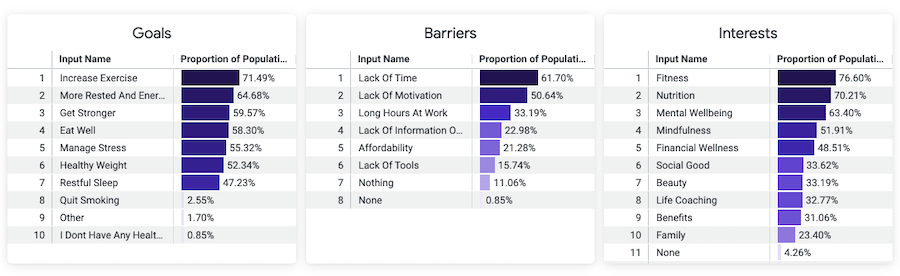
Imagine you want to understand what barriers are preventing employees from reaching their health goals. You check the Goals and Barriers data on the Population Health Preferences report and learn the most common goal is to increase exercise, but the most common barrier is a lack of time. You decide to implement group exercise classes during the workday to help employees find time to exercise.
Keep reading to understand:
What data you’ll find
You can find the following data in the Population Health Preferences & Measurements reports:
Data Points | Description |
Goals | A table showing the health goals employees reported in the Health Profile, and the percentage of employees who completed the Health Profile and reported each goal. |
Barriers | A table showing barriers to meeting health goals employees reported in the Health Profile, and the percentage of employees who completed the Health Profile and reported each barrier. |
Interests | A table showing the health interests employees reported in the Health Profile, and the percentage of employees who reported each interest. |
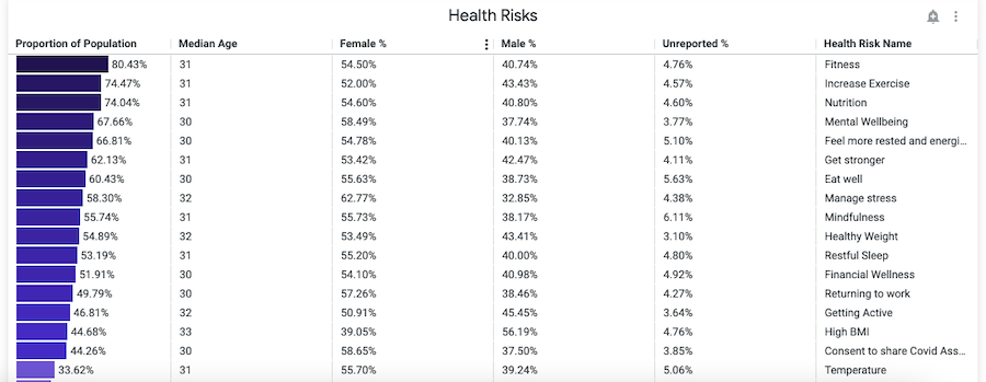
Health Risks | A table showing the:
|
Tip: Hover over the information icon to learn more about each data point.
Example View
Need help understanding the data?
We’re happy to help! Create a Case or schedule a call with a Customer Success Manager (CSM) through the Digital Success Portal.